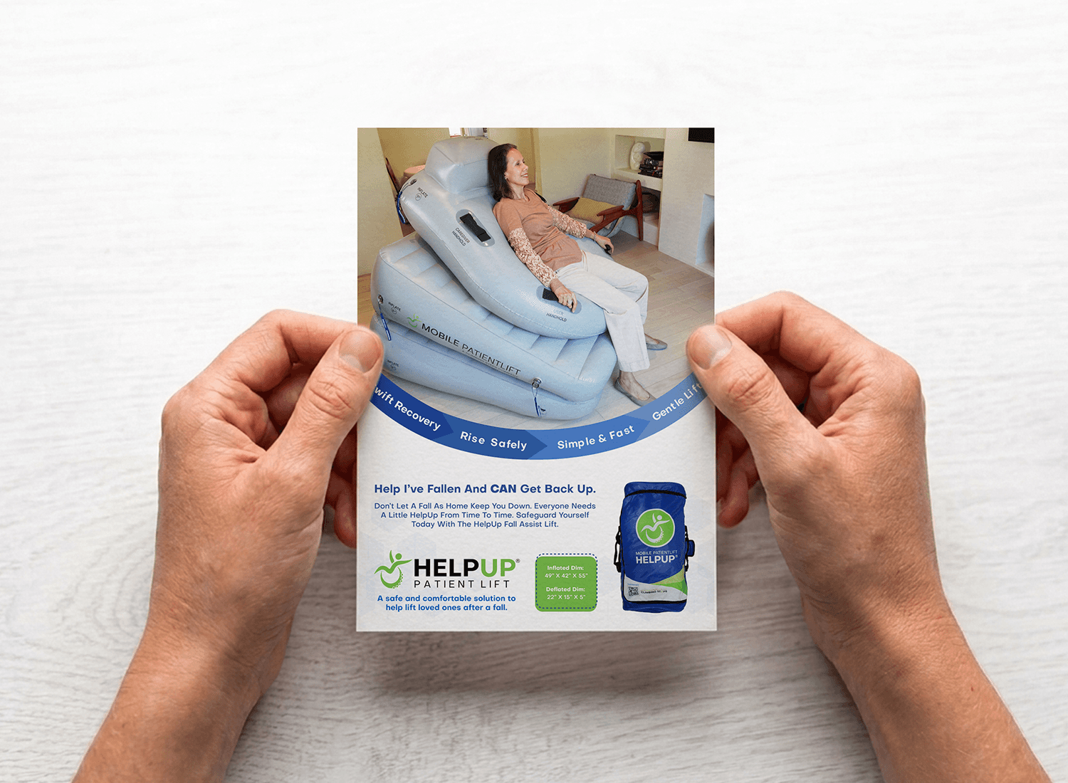
Cross-Promotional Insert Card Design
Role: Graphic Designer
Overview:
A client needed a way to put a second, unrelated product in front of customers who'd already bought something else: a 5"x7" card meant to travel inside another product's box and catch someone mid-unboxing. Unlike a mailer, it doesn't get opened on purpose, so it has to earn attention it wasn't invited to ask for. I designed a two-sided card that introduces the product fast, then gives the reader a reason to hold onto it.
Challenges:
An insert card has almost no context working in its favor. There's no subject line, no envelope, no reason to expect it. It just falls out of a box. That meant the front had a few seconds, at most, to make an unfamiliar product feel worth a second look, without leaning on jargon or a clinical product shot. The back had a different problem: it needed to carry real information, including how the product works, an offer code, and a QR code, without turning into a wall of text that undoes the warmth of the front.
My Approach:
I split the two sides by job. The front leads with a real lifestyle photo rather than a rendered product diagram, since a person in a believable moment builds trust faster than a spec sheet ever could. A curved banner wraps four short benefit phrases around the photo, doing the selling without paragraphs. The back flips into explainer mode: a three-step visual walkthrough, the discount code stated plainly up top, and the QR code repeated so the card still converts once it's out of the box and sitting somewhere else entirely. A navy and accent green palette ties both sides together and keeps the whole thing feeling dependable rather than cold.
Conclusion:
The final card does three jobs at once: it works as an ad, an explainer, and a coupon, which is exactly what an insert needs to do since it may only get looked at once. This project demonstrated my ability to design for a format with almost no built-in attention, where the piece has to generate its own reason to be read in the few seconds it gets.


